Dr. KOSPI vs. The Doomsayers
- Chris Kline

- Jan 27
- 3 min read
Updated: Feb 12
1) ASIA – The South Korean stock market, the KOSPI, is often referred to as “Dr. KOSPI” in that it is often viewed as a canary in the coal mine, giving early indications of “good” or “bad” global market action. A lot like copper is referred to as “Dr. Copper” for overall economic acceleration or deceleration. When copper is going up, usually it is followed by economic expansion…copper is clearly used in a lot of things these days. Dr. KOSPI carries some of that same weight in terms of market expectations, and it moved up another +2.7% overnight to +23% in the last month alone. Japanese stocks popped another +0.9% to +5.1% in the last month, and that is amidst all the hand-wringing about their interest rates moving up so much, which they did, that the talk was how that was going to bring down global equities. As we discussed on 1/14…Noise. Lastly, Chinese stocks continue towards new cycle highs with the Shanghai Comp +4.5% in the last month. It’s never about the “narrative” being peddled by the media, but the rate of change of growth and inflation.
2) GOLD/SILVER – Lots of storytelling in metals these days. Ignore those and look at what’s happening underneath the surface of price, namely in volatility for those metals. So far, on a weekly closing basis, this is as high as Gold volatility has been since the fall of 2008…which, of course, was fear induced by the Great Financial Crisis. Today is not that. Silver volatility has never been this high. So what does this really mean? It usually points to rapid allocation. Lots of institutional investors want to “show” exposure on their end-of-month statements. This is definitely not an area to be chasing these metals.
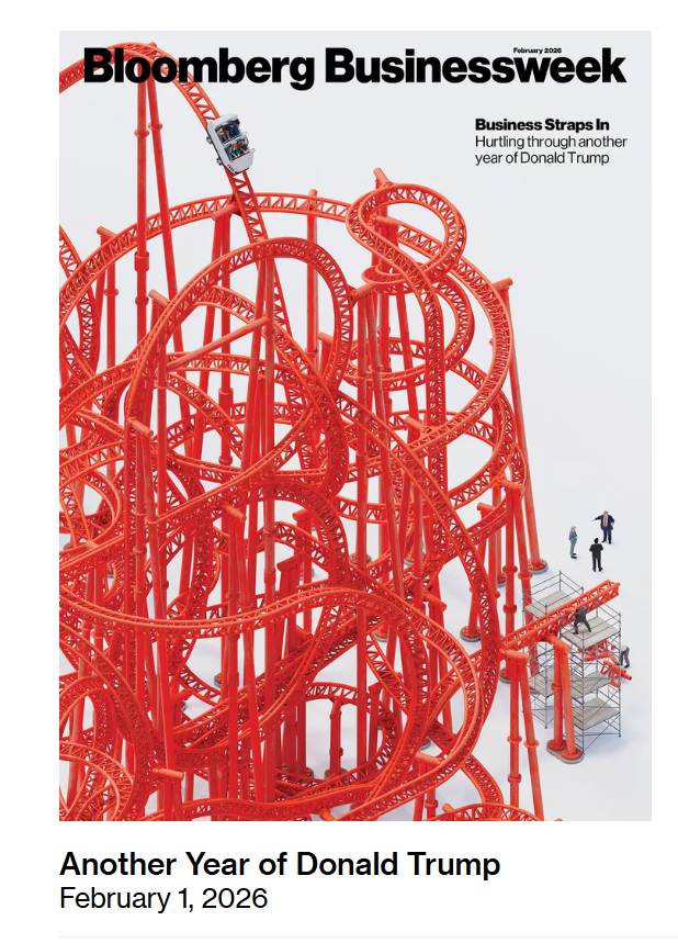
3) COVERS – Magazine covers of major business publications can, as I’ve discussed, be very telling. But not in the way most people think. Just two weeks ago, we talked about the bubble splashed across the cover of Bloomberg Businessweek. Now, this week, they follow it up with a giant red rollercoaster, doing their best to make sure anyone who sees it is properly terrified about the year ahead. This is usually how the most actionable magazine covers look. Big. Bold. Creative. Unforgettable. Think back to November, when I showed you The Economist cover that ran that upside-down skier buried in the snow, with his skis turned into red arrows pointing lower. Even the snow on his backside was shaped like a world map, suggesting global turmoil ahead. And what happened next? Markets did the exact opposite. By the time the fear is creative enough to make the cover, the market has already moved on. And, more often than not, it's setting up to do the opposite. What all this tells me right now is simple: The media is still overly pessimistic. They're not buying into the strength in equities. They're trying to scare you into believing this will be a wild rollercoaster year. I suppose it could be when all is said and done. But that’s not usually how this goes. So, we’ll watch the flows, be mindful of the indicators (including these covers) and follow the algorithms. While all the above still points to more bullish action than bearish, there are some limited, interesting signs popping up. Tomorrow, I’ll discuss exactly what those are.